Share



Published on 06 November, 2019
| Last Updated on 25 June, 2026
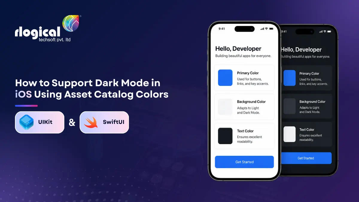
When Apple shipped Dark Mode with iOS 13 in 2019, it was a new feature teams rushed to adopt. Several iOS releases later, the situation has flipped. On iOS 26, Dark Mode is a baseline expectation rather than a bonus. Users notice when it is missing, reviewers flag it, and a single screen with light text on a light background can sink your rating.
Here is the reassuring part. The core technique from the iOS 13 era still works. Asset Catalog colors remain the cleanest way to manage colors that adapt to the current appearance, and Apple has made the workflow better over time. This guide brings that original approach up to date for current Xcode, shows the code for both UIKit and SwiftUI, and adds what matters now: semantic colors, accessibility and contrast, migrating away from hardcoded colors, and how to test your work properly.
For businesses planning a new Apple ecosystem product, a detailed overview of modern iOS development practices is available here:
https://www.rlogical.com/ios-app-development/
Dark Mode is a system wide appearance setting. The user chooses Light, Dark, or Automatic in Settings or Control Center, and every app that supports it switches its colors to match. Backgrounds turn dark, text turns light, and the interface adapts to suit low light surroundings.
Why it is worth getting right:
A note for 2026: iOS 26 introduced the Liquid Glass design language, which leans on translucency and layered materials. System materials already adapt to Light and Dark for you, so building on standard components and semantic colors means your app inherits sensible behavior in both appearances. Almost every Dark Mode bug traces back to a custom color that was hardcoded, which the rest of this guide helps you fix.
To stay updated with the latest platform changes, design patterns, and user experience expectations, you can also explore:
https://www.rlogical.com/blog/ios-app-development-trends
If you remember one thing from this article, make it this. Before creating a single custom color, use the semantic colors Apple already provides. These are colors defined by their role rather than a fixed value, and the system resolves each one to the right shade for the current appearance and accessibility settings.
In UIKit, semantic colors are properties on UIColor:
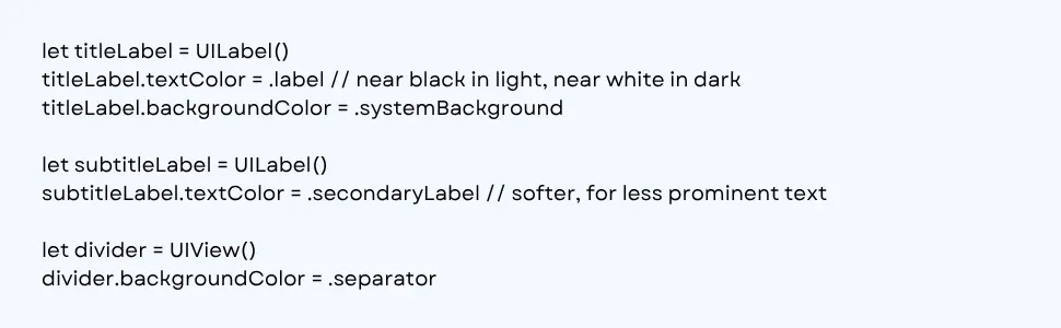
Ones you will use constantly include .label, .secondaryLabel, .tertiaryLabel, .systemBackground, .secondarySystemBackground, .tertiarySystemBackground, .separator, and the fill colors such as .systemFill.
SwiftUI has its own set, and it adapts the same way:
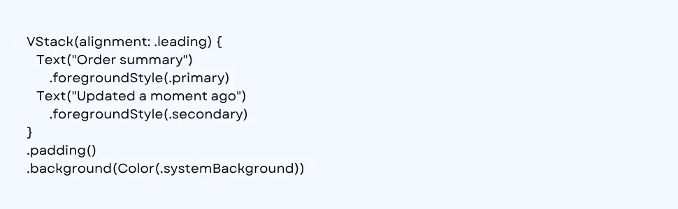
Notice foregroundStyle rather than the older foregroundColor. The newer modifier is the current recommendation and fits the rest of SwiftUI styling.
The most common Dark Mode bug is using an absolute color where a semantic one belongs. UIColor.white, UIColor.black, Color.white, and Color.black never change. White text on a custom blue card looks fine until a user in Dark Mode reaches a screen where you also set Color.white as the background, and now it is white on white. Keep pure black and white for cases where you truly want a fixed value, and let semantic colors handle the rest.
Semantic colors cover the structural parts of an interface, but every app has brand colors the system does not provide. This is where Asset Catalog color sets come in, using the same mechanism introduced back in iOS 13. It still works well.
The workflow in current Xcode:
Once the color set exists, you reference it in code. The original 2019 approach used a string based lookup:

The modern approach is better. Since Xcode 15, the build generates type safe symbols for your assets, so a typo becomes a compiler error instead of a runtime surprise:

These generated symbols require an iOS 17 or later deployment target. If you still support older versions, the string based lookup and the dynamic color shown next remain available.
When you define both variants in the catalog, you write the color once at the call site and the system swaps the underlying value as the appearance changes. No conditional logic, no manual switching.
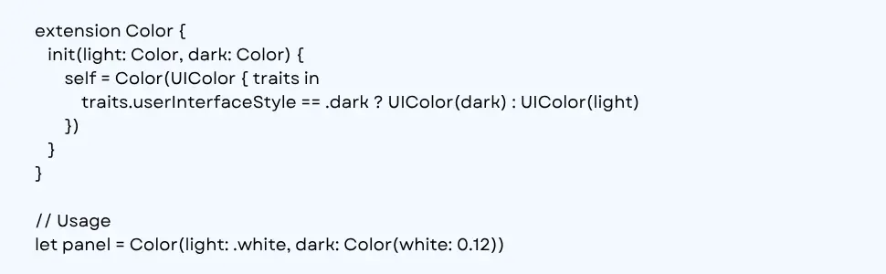
Sometimes a color is computed or arrives from a server and never lives in the catalog. UIKit lets you build an adaptive color with a closure that receives the trait collection:

For SwiftUI, a small extension keeps things tidy and gives you one property that resolves correctly in both appearances:
Colors are only half the story. Images need attention too, and the catalog handles them the same way.
For raster images such as PNGs, add a Dark variant to the image set by switching its Appearances to Any, Dark in the inspector, then drop in the alternate artwork. The system picks the right image automatically when the appearance changes. This helps with illustrations, onboarding graphics, or a logo that needs different treatment on a dark background.
Before exporting two versions of everything, consider SF Symbols. Apple’s symbol library adapts to the current appearance on its own and respects the tint you apply, so one symbol works in both modes:

For your own simple glyphs, set the image to render as a template and apply a tint. A template image ignores its own colors and takes the tint you give it, so a single asset works everywhere:

This section did not exist in the original post, and it is one of the strongest reasons to revisit your color work today.
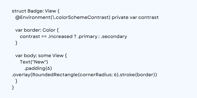
iOS has an Increase Contrast setting under Settings, Accessibility, Display and Text Size. When it is on, the system asks for higher contrast versions of your colors, and your Asset Catalog can supply them. Select a color set, then in the Appearances options enable High Contrast. You can provide a high contrast variant for both Light and Dark, which gives one named color up to four values. The accent color supports this out of the box, but for every color set you define yourself, you need to add the high contrast values.
A detail that surprises people: the high contrast version of a color tends to look darker in Light Mode and lighter in Dark Mode, because the goal in each case is to push the color further from the background.
In SwiftUI you can read the contrast setting directly and react to it:
A few contrast guidelines worth keeping in mind:
Most real projects are not starting fresh. They carry years of UIColor(red:green:blue:alpha:) calls and the occasional .white scattered through view code. Here is a practical order of operations to bring an existing app into shape without trying to fix everything at once.
Working through this one screen or feature at a time keeps each change small and easy to review. Centralizing colors pays off beyond Dark Mode too. When design updates the brand color, you change one color set instead of hunting through dozens of files.
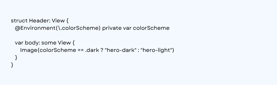
Most of the time you should let the system drive the appearance and simply supply adaptive colors. Now and then you need to know which mode is active, or you want to force a specific appearance for one screen.
In SwiftUI, read the environment to branch on the current scheme:
To force an appearance for a view and everything below it, use preferredColorScheme:

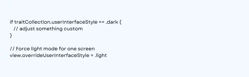
In UIKit, the trait collection reports the current style, and overrideUserInterfaceStyle lets you pin a view or an entire window:
If you need to respond when the appearance changes, note that traitCollectionDidChange was deprecated in iOS 17. The current API registers a handler for the specific traits you care about. For color work, register for the predefined set that covers appearance and contrast:

A word of caution on forcing appearance: do it sparingly. Overriding the user’s choice across a whole app tends to frustrate people who set their preference on purpose. Save it for screens that genuinely need a fixed look, such as a media viewer.
The original 2019 article closed its testing section by saying there was no real way to switch appearances and check your colors. That has not been true for years. Today you have several solid options, and skipping this step is how broken Dark Mode ships.
This is the fastest loop. Add previews for both schemes and view them side by side as you code:
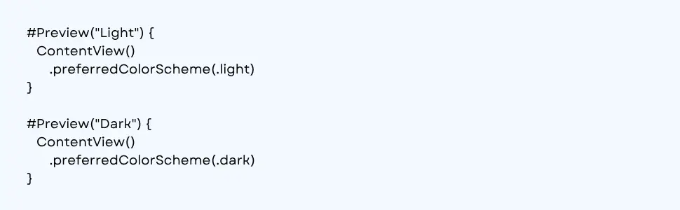
You can also use Variant mode at the bottom of the preview canvas to render Light and Dark together, and the same control offers Dynamic Type and orientation variants. That makes it easy to catch a contrast issue and a text size issue in one pass.
While running your app in the Simulator, open the Environment Overrides panel from the debug bar and flip the appearance toggle to switch instantly, with no need to dig through Settings. You can also change it under Settings in the Simulator itself.
Nothing fully replaces checking on hardware, especially on OLED screens where true blacks and contrast read differently than on a Mac display. On device, switch the appearance from Control Center or under Settings, Display and Brightness.
Turn on Increase Contrast and walk through your key screens again. Increase Dynamic Type. For a larger app, consider snapshot tests that capture screens in both appearances so a future change cannot quietly regress your colors.
To close the loop on the original article, here is a clear split.
Still relevant from the iOS 13 era:
Changed or outdated:
If you are evaluating cross-platform approaches alongside native development, this guide on Flutter-based Progressive Web Apps may also be useful:
https://www.rlogical.com/blog/develop-and-launch-progressive-web-app-with-flutter/
Supporting Dark Mode well is mostly about discipline with color. Lean on semantic colors for structure, keep brand colors in the Asset Catalog with proper Light, Dark, and high contrast variants, stop hardcoding values in view code, and test in every appearance before you ship. Do that, and your app will look right whether someone opens it on a bright morning commute or in bed with the lights off.
If you are planning a new build or want a careful review of an existing app’s color and accessibility setup, our team can help. Rlogical offers end to end iOS application development services, from consulting and design through development, deployment, and ongoing maintenance.
Partly. If you build on standard system components and semantic colors, much of your interface adapts on its own. Custom colors, especially hardcoded ones, will not adapt until you make them adaptive through the Asset Catalog or a dynamic color definition.
Dark Mode has been available since iOS 13. Since nearly every active device now runs a much newer release, you can treat Dark Mode support as a baseline expectation rather than an edge case.
Not for everything. Use semantic colors for structural elements such as backgrounds and text, since they already include both appearances. You only need explicit Light and Dark values for custom brand colors.
Set overrideUserInterfaceStyle on a view or window in UIKit, or apply preferredColorScheme in SwiftUI. Use this carefully, because overriding the user’s system preference across an entire app often frustrates people who chose their setting on purpose.
Use Xcode Previews with preferredColorScheme or Variant mode to view both appearances together, flip the appearance in the Simulator’s Environment Overrides panel, and verify on a real device. Also test with Increase Contrast and larger Dynamic Type sizes enabled.
Rahul Panchal is a visionary technology entrepreneur and the Founder & Managing Director of Rlogical Techsoft Pvt. Ltd. Passionate about the power of Artificial Intelligence, he focuses on helping businesses transform through AI-driven solutions, intelligent automation, and data-centric digital ecosystems. Alongside AI, his expertise spans scalable web and mobile platforms, Cloud, IoT, and modern enterprise technologies enabling organizations to innovate faster, optimize operations, and build future-ready digital products with real business impact.
Global insights on technology trends, best practices, and digital transformation strategies.

A proven track record of high-impact deliveries across industries and technologies
Share with us. We'll assess its feasibility, suggest the right tech stack, and share a clear cost & timeline.
Years of Experience
Projects
Countries
Engineers
Verified Client Reviews
Industry Served